Connector SDK UI endpoint icons
Endpoint and activity icons
The Integration Studio UI for a connector created with the Jitterbit Connector SDK uses icons in the UI to represent the endpoint and its activities.
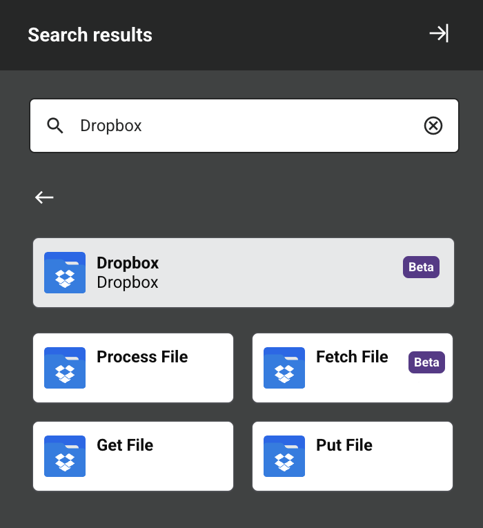
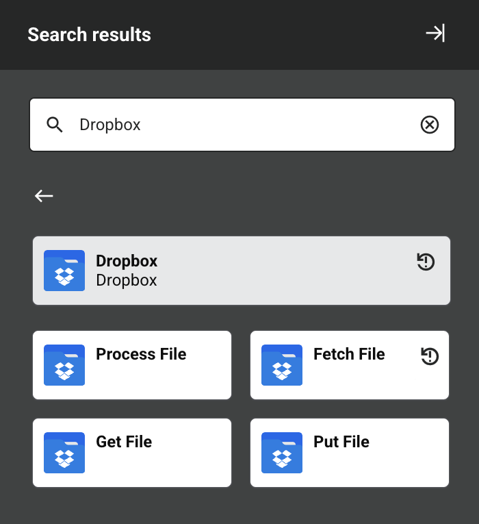
In the component palette, icons represent both the configured endpoint and its activities. This screen capture of the Dropbox connector shows how different icons are used:
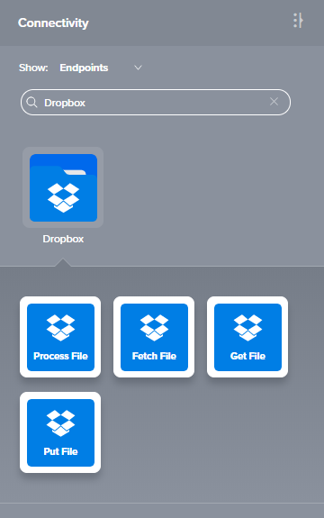
One icon (a folder) is used for the connection, with a different icon used for the activities. It's possible to have a different icon for each activity, though a common theme of colors and shapes for an endpoint is advised. As the text describing the activity is overlaid on the icon, it's best to leave the bottom half of the icon a solid color so that the white text, which can occupy up to two lines, has a solid background to appear against.
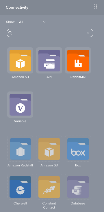
Note that unconfigured endpoints are slightly greyed compared to the configured endpoints. Compare the two Amazon S3 icons in this image:
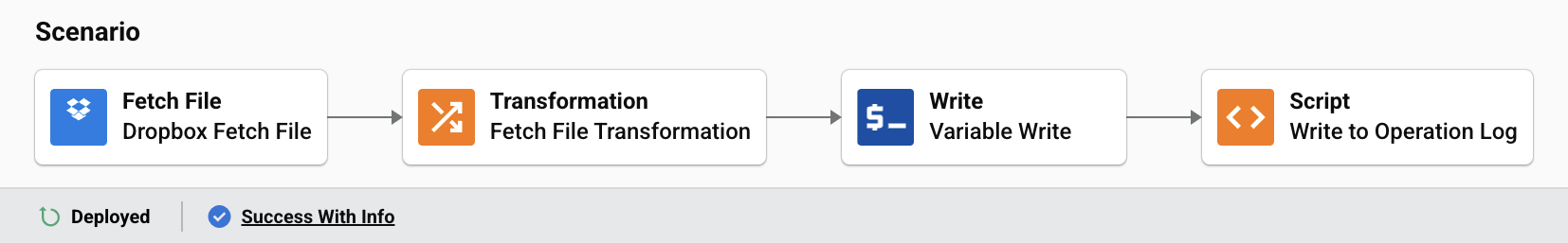
In an operation, icons represent the Dropbox connector activities:
As can be seen in the connector JSON schematic, you can define icons for the connection and each of the activities (together referred to as an endpoint). Icons are defined in SVG format, and are provided as a path to an SVG file.
To work properly in the Integration Studio UI—both graphically and aesthetically—icons must follow specific conventions in their design and creation.
As can be seen from these examples, the design pattern for an icon consists of a colored background against which a white logo is applied. White type is added by the Integration Studio UI at runtime to label the activities. For this reason, space must be left in the design of an icon to accomodate this text, which can occupy up to two lines.
Icon sizes, file type, and color rules
Two icons are required: an endpoint icon and an activity icon.
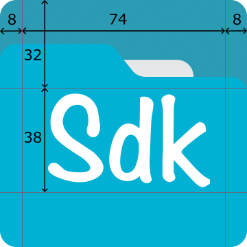
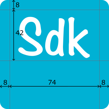
Both icons are the same size (90 pixels by 90 pixels), with the logo inside a maximum width of 74 pixels and maximum heights of 38 pixels (endpoint icon) and 42 pixels (activity icon).
An icon must be saved as an SVG file.
The icons—in order to fit with the aesthetic of Integration Studio—should follow these color rules:
-
Logo color: White. No exceptions.
-
Light color: The main brand color, preferably chosen so that it can support white type on top.
-
Dark color: Darker tint of the light color. Typically, this means reducing the brightness to 80% of the original value.
-
Gradient: Applied to the activity icon, with the light color at the top and the dark color at the bottom.
-
Sizing: The icons are to fit within the guidelines as shown on the example images below.
-
Placement: Center the icons using either mathematical or optical centering for the horizontal axis and then centered vertically in the guidelines as shown on the example images below.
Endpoint icon
The endpoint icon consists of series of folders with a white logo on top. The back-most folder is in the dark color and the front-most folder is in the light color. These colors can be assigned using the different layers of templates.
The logo needs to be created with a transparent background so that when placed on the folder images, the colors show around and through the logo appropriately.
This image shows an endpoint icon with guidelines added showing the boundaries for placement of the icon:
Activity icon
The activity icon is a solid gradient, light color at the top and dark color at the bottom. The logo can be the same as the one used in the endpoint icon or a different one, as appropriate. However, in most cases it will be the same as the one in the endpoint activity, but placed higher up, leaving space at the bottom for the activity labels.
The minimum space at the bottom should be 40 pixels (50% of height).
As with the endpoint icon, the logo needs to be created with a transparent background so that when placed on the folder images, the colors show around and through the logo appropriately.
This image shows an activity icon with guidelines added showing the boundaries for placement of the icon:
Badges
Icons can be displayed with a beta or a deprecated badge in the upper left-hand corner. These can be set on the endpoint and the activities icons and are configured by adding appropriate properties to the metadata of an endpoint or activity.
- To add a beta badge, set the
isPreviewproperty totrue:
"isPreview": true,
- To add a deprecated badge, set the
isDeprecatedproperty totrue:
"isDeprecated": true,
For example, to set a Dropbox endpoint and its Fetch to have a beta badge:
{
  "name": "Dropbox",
  "isPreview": true,
  "endpoint": {},
  "activities": {
    "fetch": {
      "displayName": "Fetch File",
      "isPreview": true,
      "properties": []
    }
  }
}
To set a Dropbox endpoint and its Fetch activity to have a deprecated badge:
{
  "name": "Dropbox",
  "isDeprecated": true,
  "endpoint": {},
  "activities": {
    "fetch": {
      "displayName": "Fetch File",
      "isDeprecated": true,
      "properties": []
    }
  }
}
Working examples
The examples shown above are available as SVG files:
- Endpoint icon:
endpoint.svg - Activity icon:
activity.svg
See the Dropbox connector's adapter.json file for a working example using icon files.
For examples of different logos and color treatments, see the current selection of connectors available in Integration Studio.