Table component
Overview
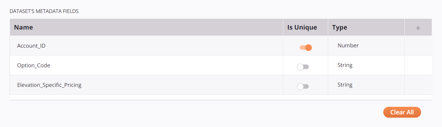
The Table component can be used wherever a user needs to provide multiple entries for an endpoint or an activity but where a Key-Value component is too limiting. In this example, the user can enter a name, specify a boolean value, and select from a list of types:
Component features
The Table component includes built-in behavior for adding, editing, and deleting table rows:
- Plus icon: Clicking the plus icon adds a new row at the bottom of the table.
- Existing row: Hovering over an existing row reveals the Pencil and Trash icons.
- Pencil icon: Clicking turns on edit mode for a row.
- Trash icon: Clicking deletes the row.
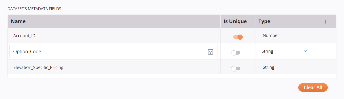
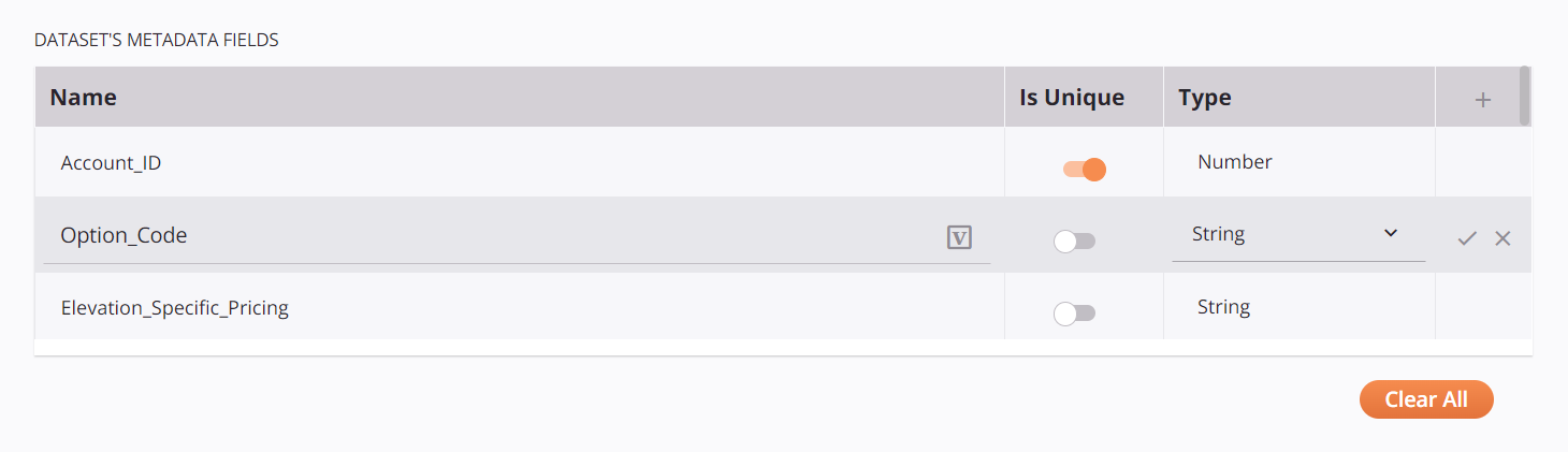
- Edit mode: Reveals the Variable icon available on text fields. Hovering while in edit mode reveals the Checkmark and Discard icons.
-
Variable icon: Indicates the text field supports using global variables, project variables, and Jitterbit variables. Begin either by typing an open square bracket
[into the field or by clicking the variable icon to display a list of the existing variables to choose from.Important
For variable values to be populated at runtime, the agent version must be at least 10.75 / 11.13.
-
Checkmark icon: Clicking saves all changes to the current row and exits edit mode.
- Discard icon: Clicking discards all changes to the current row, exits edit mode, and reverts the row back to its previous value.
- Clear All: Clicking deletes all rows in the table.
Hovering over an existing row reveals Pencil and Trash icons:

In edit mode after clicking the Pencil icon, showing the Variable icon:
Hovering while in edit mode reveals the Checkmark and Discard icons:
Component JSON
{
  "name": "exampleConfiguration",
  "displayName": "Dataset's Metadata fields",
  "type": "table",
  "use": {
    "ui": {
      "items": [
        {
          "name": "name",
          "displayName": "Name",
          "type": "string",
          "defaultValue": "",
          "validators": [
            {
              "name": "required"
            }
          ]
        },
        {
          "name": "number",
          "displayName": "Number",
          "type": "number",
          "defaultValue": 2,
          "validators": [
            {
              "name": "required"
            },
            {
              "name": "max",
              "args": [ 5 ]
            },
            {
              "name": "min",
              "args": [ 0 ]
            }
          ]
        },
        {
          "name": "isUnique",
          "displayName": "Is Unique",
          "type": "boolean",
          "defaultValue": true
        },
        {
          "name": "type",
          "displayName": "Type",
          "type": "select",
          "enumValues": [
            {
              "enumValue": "String",
              "realValue": "string"
            },
            {
              "enumValue": "Number",
              "realValue": "number"
            }
          ],
          "defaultValue": "string"
        }
      ],
      "values": {
        "name": [
          "Test1",
          "Test2"
        ],
        "number": [
          2,
          4
        ],
        "isUnique": [
          true,
          false
        ],
        "type": [
          "string",
          "number"
        ]
      }
    }
  }
}
In the JSON describing the table, these properties can be configured:
name: Unique name for the table component.displayName: The title displayed above the table in the Cloud Studio UI.type: The table component type must be"table".-
items: An array of items describing the table header and the type of each column. Supported column types arestring,number,boolean, andselect. Each column can have its own validator if required. For each item, these entries can be created:name: Unique name for the column.displayName: Display name for the column.type: Data type for the column.widgetHint: An optional hint for the type of component to use when displaying the values of the column.defaultValue: An optional default value to use for any new entries in the column.validators: An optional list of validators.
-
values: If predefined data values are required for a column, specify them in this section using the same key (the value of thenamefield) for each item. A user’s selection will appear in this section when the component data is returned to the connector in thepropsobject.
In the example above, the items array has four elements and the values map has four matching keys (name, number, isUnique, and type).
Component output
The table component returns to the connector its output in the form of a JSON string. This string must be converted back into an object using a parser such as Jackson before it can used.