Select Fields component
Overview
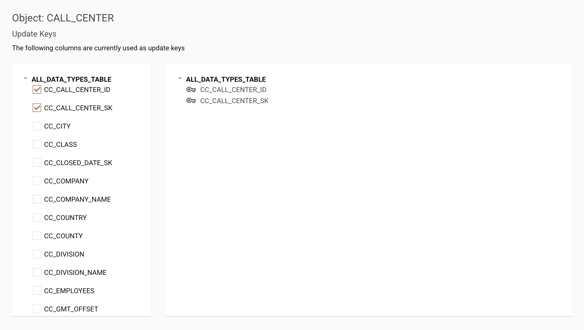
The Select Fields component lets a user specify a set of fields from a list. It must be preceded by a List Object Component on a previous step to provide data to the component.

Component JSON
{
  "name": "select-fields-page",
  "type": "pagination",
  "children": [
    {
      "name": "select-field",
      "type": "select-fields",
      "widgetHint": "component:connector/select-fields",
      "use": {
        "ui": {
          "actionTitle": "Update Keys",
          "actionMessage": "The following columns are currently used as update keys"
        }
      }
    }
  ]
}
In the JSON describing the select-fields, these properties can be configured:
type: The list object component type must be"select-fields".widgetHint: The filter builder componentwidgetHintmust be"component:connector/select-fields".actionTitle: The title that appears above the component. Default is an empty ('') title.actionMessage: A meesage which appears between the titel and the component. Default is an empty ('') message.
Component output
The select fields returns to the connector its output as an object in the form of a JSON string with three fields:
objectId: The ID of the object.allFields: An array of objects containing each field displayed in the UI.selectedFields: An array containing the names of the selected fields. This array can be empty.
Rendered as JSON, here is sample output from the above select fields component:
{
  "objectId": "CALL_CENTER",
  "allFields": [
    {
      "name": "CC_CALL_CENTER_ID",
      "displayName": "CC_CALL_CENTER_ID",
      "selected": false,
      "node": {
        "N": "CC_CALL_CENTER_ID",
        "T": "VARCHAR(16)",
        "D": "",
        "PN": "CALL_CENTER",
        "MN": 0,
        "MX": 1,
        "NS": "",
        "O": {
          "isFilterable": "true"
        }
      }
    },
    . . .
    {
      "name": "CC_ZIP",
      "displayName": "CC_ZIP",
      "selected": false,
      "node": {
        "N": "CC_ZIP",
        "T": "VARCHAR(10)",
        "D": "",
        "PN": "CALL_CENTER",
        "MN": 0,
        "MX": 1,
        "NS": "",
        "O": {
          "isFilterable": "true"
        }
      }
    }
  ],
  "selectedFields": [
    "CC_CALL_CENTER_SK",
    "CC_CITY"
  ]
}