List Object component
Overview
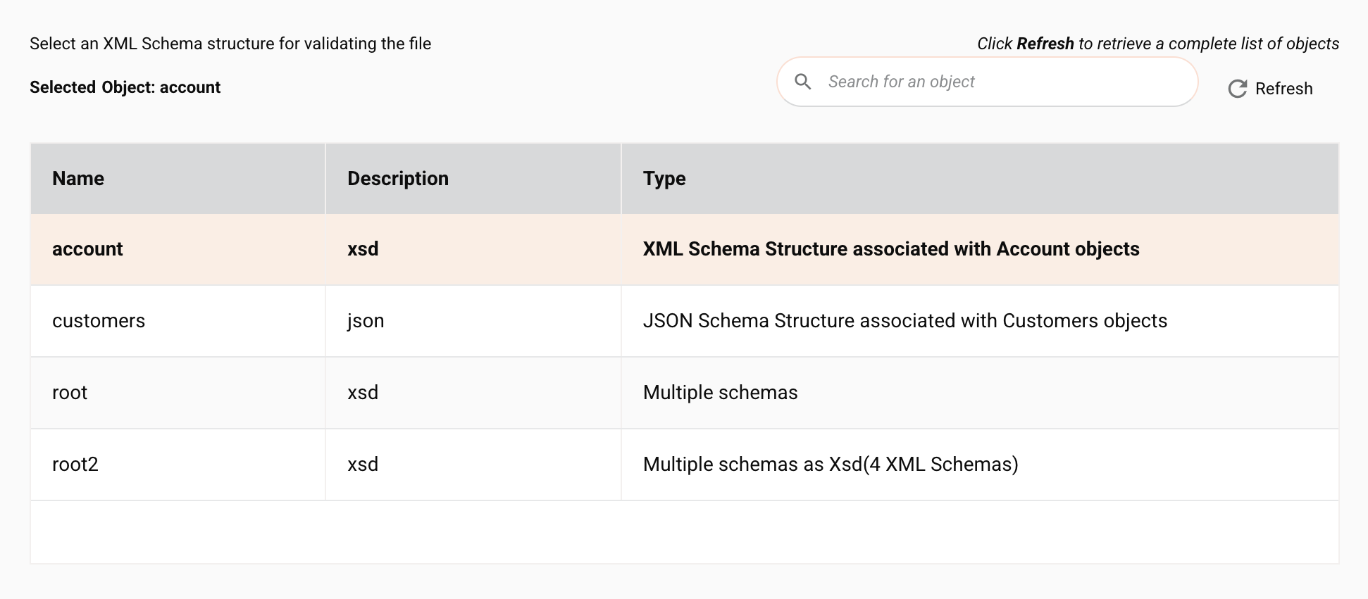
The List Object component dynamically generates, at design time, a list of objects. The user's selection from that list can then be used to determine the behavior of the connector or the configuration of other components. For example, you can use a list object on one page and then the user's selection can determine the contents shown in a list object or other components on a following page.
A list object is used in conjunction with other components such as Describe Object, Filter Builder, Select Fields, and Transfer List Component to supply them with the data they require for instantiation.

Component features
The List Object component includes built-in behavior for searching, refreshing, and selecting list objects:
- Search bar: Users can type a keyword and filter the rows. All available columns are searched.
- Refresh: Clicking fetches data from the connector and updates all rows.
- Selecting and deselecting: To select a row, users click on a row; clicking again will deselect the selected row.
Component JSON
{
  "name": "list-object",
  "displayName": "Select an XML Schema structure for validating the file",
  "type": "list-object",
  "use": {
    "ui": {
      "pageDescription": "Select an XML Schema structure for validating the file",
      "selectObjectLabel": "Selected Dropbox Object: ",
      "tableHeaders": [
        "Name",
        "Type",
        "Description"
      ]
    },
    "discoveryType": "provided",
    "orientation": "output",
    "documentIdPath": "this"
  },
  "validators": [
    {
      "name": "required"
    }
  ]
}
In the JSON describing the list object, these properties can be configured:
name: Unique name for the list object component.displayName: The title displayed above the list object in the Integration Studio UI.type: The list object component type must be"list-object".pageDescription: The description inserted above the list object. By convention, it usually starts with the word Select and references a specific object, such as"Select an XML Schema structure for validating the file".selectedObjectLabel: An optional description in bold type inserted above the list object that dynamically changes based on the selection. By convention, it starts with the past tense of the verb used in thepageDescription, and ends with a colon and a space character to create the appropraite spacing, such as"Selected Object: ". Notice that this is distinct (it isselected) from the next property (selectObjectLabel) and is used only if the list object depends on data from a previous page. See Component Previous Pages for details.selectObjectLabel: An optional description, set in bold type and inserted above the list object, that dynamically changes based on the selection. By convention, its value starts with the past tense of the verb used in thepageDescription, and ends with a colon and a space character so as to create appropriate spacing, such as the value"Selected Dropbox Object: ".-
tableHeaders: An optional array of headers which will be the labels (display names) shown at the top of the list object. For example:[ "Name", "Type", "Description" ],If left undefined,
"Name"and"Description"are shown by default.Important
The object data shown in the list object depends on the number of headers defined:
- If no headers are defined,
N(name) andD(description) are shown - If 1 header is defined,
N(name) is shown - If 2 headers are defined,
N(name) andD(description) are shown - If 3 headers are defined,
N(name),T(type), andD(description) are shown
The above column orders are set and displaying additional headers is not supported.
- If no headers are defined,
-
defaultValueFromProp: If this particular component needs to fetch data based on selected or provided data from a previous page, you can optionally provide here the name of the previous page's property and the component will use that property to fetch the data. See Component Previous Pages for details. discoveryType: The discovery type is"provided", and the implementation of this must be completed by the developer as described in the Component Discovery.orientation: This is set to"output".documentIdPath: This is set to"this".
Component discovery
When the connector with a list object is being configured by a user, the connector's getObjectList() methods are called, either in the connection or in the activities.
In this code sample from the ProcessFileActivity of the Dropbox connector, the discoverable objects are mapped to data for display. In this particular example the values are hard-coded strings. However, they could be dynamically generated and pulled from a database or other data source. The results of the selection at design time are then used to determine which XSD schema file is used to process the data the connector receives.
@Override
public List<DiscoverableObject> getObjectList(DiscoverContextRequest<DiscoverableObjectRequest> objectListRequest)
    throws DiscoveryException {
  List result = new ArrayList<DiscoverableObject>();
  DiscoverableObject obj = new DiscoverableObject();
  obj.setObjectName("account")
    .setObjectType("xsd")
    .setObjectDesc("XML schema associated with Account objects");
  result.add(obj);
  obj = new DiscoverableObject();
  obj.setObjectName("contacts")
    .setObjectType("xml")
    .setObjectDesc("XML schema associated with Contact objects");
  result.add(obj);
  obj = new DiscoverableObject();
  obj.setObjectName("customer")
    .setObjectType("json")
    .setObjectDesc("JSON schema associated with Customer objects");
  result.add(obj);
  return result;
}
Component previous pages
If this particular component needs to fetch data based on selected or provided data from a previous page, you can provide the name of the previous page's property as the defaultValueFromProp in the JSON describing the component and the component will use that property to fetch the data.
The value that was obtained from a previous page will be shown in the Integration Studio UI with the selectedObjectLabel as a line of text between the pageDescription and the selectObjectLabel.