Basic Connector SDK UI components
Overview
These basic UI components are available:
- String entry with default value
- String entry without default value
- String entry with obscured entry (“Password”)
- String entry with hidden entry (No visible UI element)
- Text area
- Number entry
- Boolean entry (Checkbox)
- Radio choice
- Dropdown menu
More sophisticated UI components are available and described as Complex Components.
Basic UI components
This sample shows the available basic components, with detailed code fragments in the examples that follow:
Common characteristics
All UI components can have a defaultValue and validators; see the first string field for an example of both. Validators are described in Adding and Creating Validation.
Fields that show a variable icon  are UI component examples that support variable replacement. When a user enters an opening square bracket (
[), a list of possible variable completions (Jitterbit, project, and global variables) will be displayed. Currently, only a String Entry UI component supports variable replacement.
Retrieve values
Values are retrieved from the properties based on their name. This means that names need to be unique to each connection and activity.
The connection factory method is passed an instance of the properties (props) that can be used for retrieving values:
@Override
public Connection createConnection(Map<String, String> props) {
  String accessToken = props.get(ACCESS_TOKEN);
  String appKey = props.get(APP_KEY);
  String locale = !props.containsKey(LOCALE) ? Locale.getDefault().toString() : "EN_US";
  if (accessToken == null || accessToken.length() == 0) {
    throw new RuntimeException("Access Token property cannot be empty. " +
      "Specify the access token associated with the registered Dropbox application.");
  }
  if (appKey == null || appKey.length() == 0) {
    throw new RuntimeException("App Key property cannot be empty. " +
      "Specify the app key associated with the registered Dropbox application.");
  }
  return new DropboxConnection(appKey, accessToken, locale);
}
In the above example, the accessToken and appKey values are retrieved from the properties using the appropriate keywords (ACCESS_TOKEN, set to"access-token" and APP_KEY, set to "app-key").
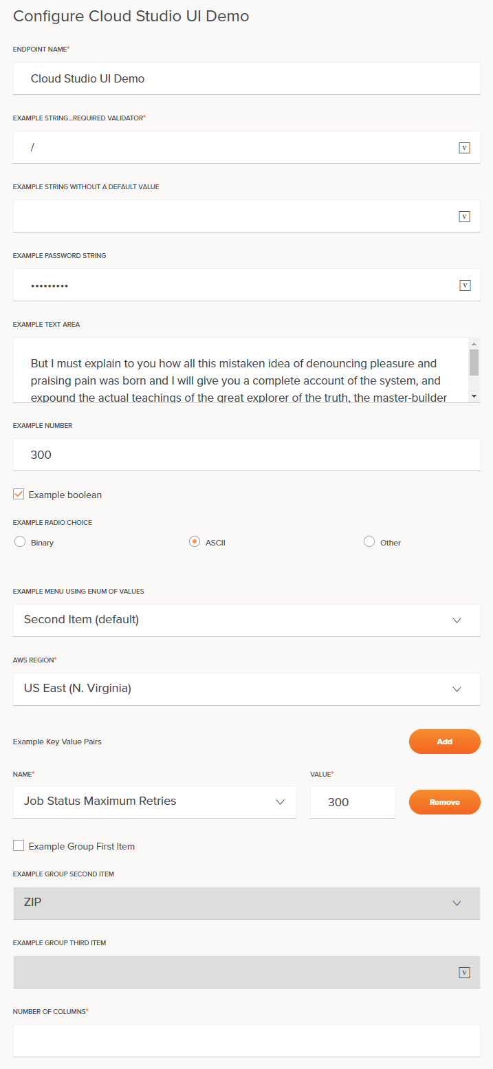
String entry with default value
{
  "name": "example_string_with_default",
  "type": "string",
  "defaultValue": "/",
  "displayName": "Example string...required validator",
  "validators": [
    {
      "name": "required"
    }
  ]
}
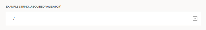
String entry without default value
{
  "name": "example_string_without_default",
  "type": "string",
  "displayName": "Example string without a default value"
}
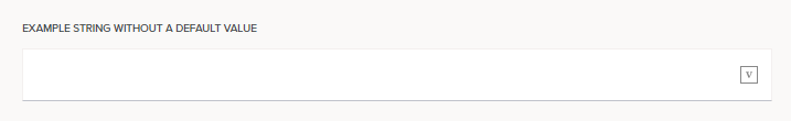
String entry with obscured entry (“Password”)
{
  "name": "example_password_string",
  "type": "string",
  "displayName": "Example password string",
  "multiple": false,
  "widgetHint": "password"
}
String entry with hidden entry (No visible UI element)
In this case, no visible UI element is displayed. A value is available for setting, either as a default value or programmatically by other components.
{
  "name": "example_hidden_string",
  "type": "string",
  "displayName": "Example hidden string",
  "defaultValue": "hidden_value",
  "hidden": true,
  "multiple": false
}
Text area
Designed for multiple lines of text.
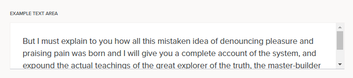
{
  "name": "example_textarea",
  "type": "textarea",
  "displayName": "Example text area",
  "location": "last",
  "multiple": false,
  "widgetHint": "textarea"
}
Number entry
For entering numbers, with increment/decrement arrows (visible either on mouse-over or when the field is in focus) and keyboard arrow activation (up and down arrow keys increase and decrease the value).
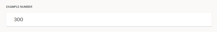
{
  "name": "example_number",
  "type": "number",
  "displayName": "Example number",
  "multiple": false
}
Boolean entry (Checkbox)

{
  "name": "example_boolean",
  "type": "boolean",
  "displayName": "Example boolean",
  "defaultValue": true,
  "multiple": false
}
Radio choice
Used to create radio button groups. The realValue is the value that will be returned when retrieved from the properties in the connector. The enumValue is displayed to the user.
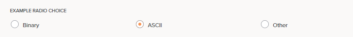
{
  "type": "string",
  "multiple": false,
  "name": "radio_choice_example",
  "widgetHint": "radio-choice",
  "displayName": "Example radio choice",
  "enumValues": [
    {
      "enumValue": "Binary",
      "realValue": "1"
    },
    {
      "enumValue": "ASCII",
      "realValue": "2"
    },
    {
      "enumValue": "Other",
      "realValue": "3"
    }
  ],
  "defaultValue": "2"
}
Dropdown menu
Used to create dropdown menu groups. The realValue is the value that will be returned when retrieved from the properties in the connector. The enumValue is displayed to the user.
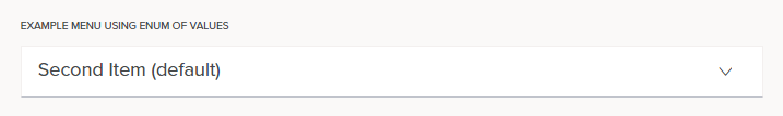
{
  "name": "enum_example",
  "displayName": "Example menu using enum of values",
  "enumValues": [
    {
      "enumValue": "First Item",
      "realValue": "0"
    },
    {
      "enumValue": "Second Item (default)",
      "realValue": "1"
    },
    {
      "enumValue": "Third Item",
      "realValue": "2"
    }
  ],
  "defaultValue": "1"
}
Dropdown menus support editing and searching. This is specified by setting an additional property, enumOptions, which supports editable and searchable:
editable: Iftrue, a user can add a new option to the dropdown and select that new option. The default isfalse.searchable: Iftrue, a user can type into the dropdown to filter the existing optoins in the dropdown. The default isfalse.
The two options can be combined if desired. The presence of one does not imply the other. For example, a version selection could be:
{
    "name": "version",
    "displayName": "Version",
    "enumValues": [
        {
            "enumValue": "v33.0",
            "realValue": "v33.0"
        },
        {
            "enumValue": "v33.1",
            "realValue": "v33.1"
        }
    ],
    "enumOptions": {
        "editable": true
    },
    "defaultValue": "v33.1"
}
AWS region dropdown menu example
This is a longer example showing how properties that a user will need to provide when configuring a connection or activity can be hard-coded for selection. In this sample, the AWS Region for connecting to the Amazon S3 endpoint is something that the user will need to provide. The realValue is the value that will be returned when retrieved from the properties in the connector. The enumValue is displayed to the user.
To specify it in the adapter.json and in the UI you could provide a dropdown selection for specifying this:
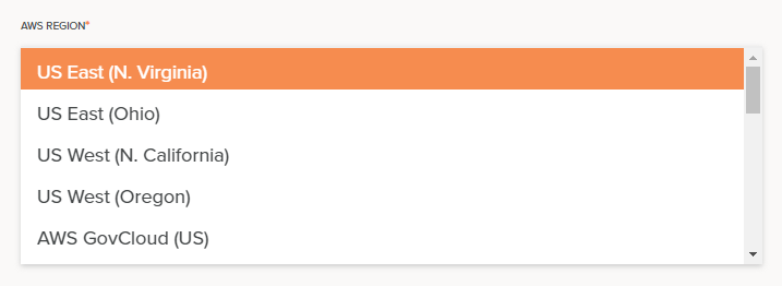
This code fragment defines the dropdown menu:
{
    "name": "region",
    "displayName": "AWS Region",
    "type": "string",
    "defaultValue": "us-east-1",
    "enumValues": [
        {"realValue": "us-gov-west-1",  "enumValue": "AWS GovCloud (US)"},
        {"realValue": "us-east-1",      "enumValue": "US East (N. Virginia)"},
        {"realValue": "us-east-2",      "enumValue": "US East (Ohio)"},
        {"realValue": "us-west-1",      "enumValue": "US West (N. California)"},
        {"realValue": "us-west-2",      "enumValue": "US West (Oregon)"},
        {"realValue": "eu-west-1",      "enumValue": "EU (Ireland)"},
        {"realValue": "eu-west-2",      "enumValue": "EU (London)"},
        {"realValue": "eu-west-3",      "enumValue": "EU (Paris)"},
        {"realValue": "eu-central-1",   "enumValue": "EU (Frankfurt)"},
        {"realValue": "eu-north-1",     "enumValue": "EU (Stockholm)"},
        {"realValue": "ap-south-1",     "enumValue": "Asia Pacific (Mumbai)"},
        {"realValue": "ap-southeast-1", "enumValue": "Asia Pacific (Singapore)"},
        {"realValue": "ap-southeast-2", "enumValue": "Asia Pacific (Sydney)"},
        {"realValue": "ap-northeast-1", "enumValue": "Asia Pacific (Tokyo)"},
        {"realValue": "ap-northeast-2", "enumValue": "Asia Pacific (Seoul)"},
        {"realValue": "cn-north-1",     "enumValue": "China (Beijing)"},
        {"realValue": "cn-northwest-1", "enumValue": "China (Ningxia)"},
        {"realValue": "ca-central-1",   "enumValue": "Canada (Central)"}
    ],
    "validators": [{
        "name": "required"
    }]
}
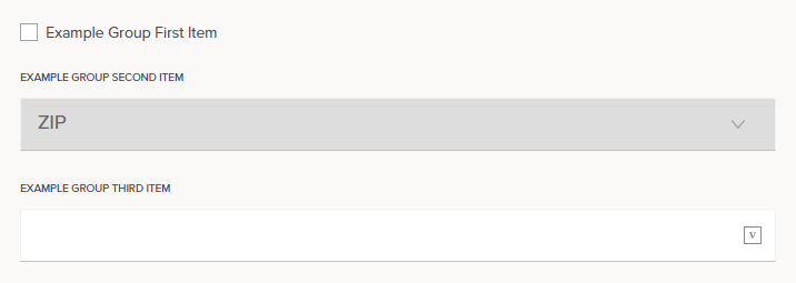
Grouping
Items can be grouped and activated and deactivated by the user as shown below. In this example, when the checkbox is false, the items in the group that follows it are inactive:
Note
Although the third item in the group above (“Example Group Third Item”) appears to be active, it does not allow user input and is in fact inactive.
Selecting the checkbox activates the group, allowing entry in both the second and third items:
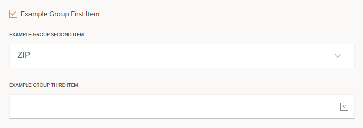
The code fragment for this:
{
  "name": "example_group",
  "type": "group",
  "displayName": "Example Group",
  "children": [
    {
      "name": "example_group_first_item",
      "type": "boolean",
      "multiple": false,
      "displayName": "Example Group First Item",
      "defaultValue": false
    },
    {
      "name": "example_group_second_item",
      "type": "string",
      "multiple": false,
      "displayName": "Example Group Second Item",
      "location": "last",
      "defaultValue": "1",
      "enumValues": [
        {
          "enumValue": "Postal Code",
          "realValue": "0"
        },
        {
          "enumValue": "ZIP",
          "realValue": "1"
        }
      ],
      "deps": {
        "disabled": {
          "op": "not",
          "args": {
            "op": "prop",
            "args": "example_group_first_item"
          }
        }
      }
    },
    {
      "name": "example_group_third_item",
      "type": "string",
      "multiple": false,
      "displayName": "Example Group Third Item",
      "widgetHint": "password",
      "defaultValue": "",
      "deps": {
        "disabled": {
          "op": "not",
          "args": {
            "op": "prop",
            "args": "example_group_first_item"
          }
        }
      }
    }
  ]
}
Validators
A field can include a list of one or more validators that checks a user entry and confirms its correctness. If a validator fails, an error message is presented to the user. Validators are triggered when a user exits a field, typically using the tab key:
Examples of validators are requiring an entry, using only digits, requiring an email address, or entering a ZIP code. Standard validators for common situations such as string length and numeric value are available, and pattern validators can be created as required.
The validators are based on the Angular Validators, except for the hasValue and requiredExpr validators, which are custom Cloud Studio validators.
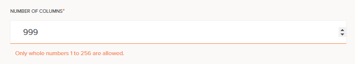
All validators are called following the pattern as shown by this example:
{
    "displayName": "Number of columns",
    "name": "noOfColumns",
    "type": "number",
    "validators": [
        {
            "name": "required"
        },
        {
            "args": [
                "^([1-9]|[1-9]\\d|1\\d\\d|2[0-4]\\d|25[0-6])$"
            ],
            "errorMessage": "Only whole numbers 1 to 256 are allowed.",
            "name": "pattern"
        }
    ]
}
Here, two validators are shown for the noOfColumns field. The first validator is a required validator, which requires only that the name be specified to invoke it. This means that the field must be completed (is required). A red asterisk in the Cloud Studio UI indicates that the field is required.
The second validator is a pattern validator, which is looking for a string that matches the regular expression pattern given by ^([1-9]|[1-9]\\d|1\\d\\d|2[0-4]\\d|25[0-6])$. If this validator fails, the error message will be shown to the user. Note that the actual pattern used will be ^([1-9]|[1-9]\d|1\d\d|2[0-4]\d|25[0-6])$, as any backslashes in the pattern must be escaped.
A validator is called by name, and any arguments are passed as a list, as shown in the above examples. An error message that is to be returned can optionally be specified. If not specified, a default error message is used (as covered for each validator below). Note how the error message can access the attributes of the field such as displayName and args to create validators that are extensible and not fragile to code changes.
These validators are available by name:
-
required- Takes no arguments
- Default message:
${displayName} is required
-
requiredTrue- Takes no arguments
- Default message:
${displayName} is required - This validator is commonly used for required checkboxes
-
email- Takes no arguments
- Default message:
${displayName} must be a valid email address
-
hasValue(Cloud Studio custom validator)- Takes no arguments
- Default message:
${displayName} is required
-
min- Takes one argument: the minimum numeric value
- Default message:
${displayName} must have a value of at least ${args[0]}
-
minlength- Takes one argument: the minimum number of characters
- Default message:
${displayName} must be at least ${args[0]} characters
-
max- Takes one argument: the maximum numeric value
- Default message:
${displayName} has a value greater than ${args[0]}
-
maxlength- Takes one argument: the maximum number of characters
- Default message:
${displayName} exceeds ${args[0]} characters
-
pattern- Takes one argument: a string JavaScript regular expression pattern that the entry must match
- Any backslashes in the pattern must be escaped: the pattern
[^\s]+must be entered as[^\\s]+ - Default message:
${displayName} is invalid
-
requiredExpr(Cloud Studio custom validator)- Takes one argument: an expression that must be satisfied
- Default message:
${displayName} is required
Example patterns
| Pattern | Description |
|---|---|
^[0-9]+$ | Only whole numbers 1 or greater are allowed. |
^[1-9][0-9]{0,6}$ | Invalid number format or maximum length exceeded. |
^([1-9]|[1-9]\\d|1\\d\\d|2[0-4]\\d|25[0-6])$ | Only whole numbers 1 through 256 are allowed. |
[^\\s]+ | A valid string is required. |
Any backslashes in the pattern must be escaped: the pattern [^\s]+ must be entered as [^\\s]+
Working example
See the Dropbox connector’s adapter.json file for a working example using many of these UI components.