Adapter JSON
The Integration Studio UI for a connector created with the Jitterbit Connector SDK is defined by a JSON file included in the JAR file that packages the connector. By convention and by default, this file is named adapter.json.
The name of this file can be different as the name used is that specified in the Jitterbit-Connector-UI entry of the MANIFEST-MF file:
Jitterbit-Connector-UI: adapter.json
See Connector registration: Connector manifest for details on the MANIFEST.MF file.
Adapter JSON file
The developer of a connector defines all of the UI components in the adapter.json file. These components are displayed when the user configures the connector and its activities, and the values entered can be retrieved by the connector code.
Adapter JSON file structure
Here is an overall schematic of the JSON file that defines a connector UI, with placeholder values shown as "<name>". The terms used and their meanings are discussed after this example:
{
  "name": "<name>",
  "version": "1.0.0",
  "sandbox": true,
  "defaultActivityIcon": "<path-to-SVG-file>",
  "endpoint": {
    "displayName": "<display-name>",
    "icon": "<path-to-SVG-file>",
    "properties": [ "<properties>" ]
  },
  "activities": {
    "activity-1": {
      "displayName": "<display-name-1>",
      "icon": "<path-to-SVG-file>",
      "properties": [ "<properties>" ]
    },
    "activity-2": {
      "displayName": "<display-name-2>",
      "properties": [ "<properties>" ]
    },
    . . .
  }
}
In this schematic, a connector has been defined with properties for the endpoint and its first two activities. Additional activities can be added as required.
For the connection (which is what appears when an end user first configures the connector in the Integration Studio UI), a set of properties can be defined that will be used to generate one or more steps that the end user completes to configure the connection to the endpoint.
Note that the name and version used must be the same name and version that the connector is registered under (see Connector registration).
The sandbox property can be set to true or false. Set to true means that the connector is in development, and will not be cached by Harmony. Instead, each invocation will reload the connector from the Jitterbit private agent. Once you have a production version, you can set this to false so that caching can be used to speed use.
A set of properties is defined for each activity, generating steps for configuring the activity after it is added to an operation in Integration Studio.
Endpoint icons
As can be seen in the above schematic, you can define icons for the connection and each of the activities (together referred to as an endpoint). Icons are defined using SVG, and are provided as a path to an SVG file.
These keys can be provided in the adapter.json:
| Key | Description |
|---|---|
defaultActivityIcon | Path to an SVG file, used as the icon if an icon is not defined for the endpoint or an activity |
icon | Path to an SVG file, used as the icon for the endpoint or for an activity |
In the schematic example above, a default icon has been defined, with the connection and the first activity using other—perhaps different—icons. The second activity does not have an icon defined, and instead uses the default icon.
This screen capture of the Dropbox connector shows how different icons can be used:
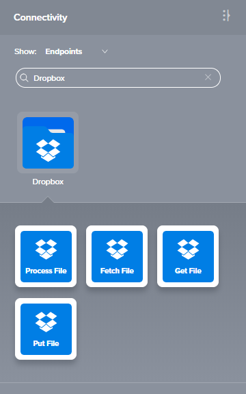
One icon (a folder) is used for the connection with a different icon used for the activities. It's possible to have a different icon for each activity, though a common theme of colors and shapes for an endpoint is advised. Note that text describing the activity is overlaid on the icon. It's best to leave the bottom half of the icon a solid color so that the white text has a background to appear against.
For details on creating the SVG files, including templates and a walkthrough, see Connector SDK UI endpoint icons.
Activity and icon order
Note
Currently, Integration Studio does not honor the order of activites and icons in JSON. However, to future-proof a connector, we recommend following these guidelines when creating a connector.
The order of the icons in the UI should follow the order of the activities in the JSON. If the number of activities exceeds three, additional rows of activities are added in the UI underneath the original row.
Our recommendation for the order of activities is to follow these common patterns:
- Read, Write
- Query (or Search), Create, Update, Upsert, Delete
- Get, Post, Put, Delete
- Request, Response
- Download, Upload
If there are any custom, special, or entity-specific activities outside of the above examples (such as Get List), put them toward the beginning of the order if they are intended to provide data as a source in an operation, and toward the end if they are intended to receive data as a target in an operation.
Pagination
For the connection and each activity, properties are defined in a JSON structure. These create the configuration steps (pages) that an end user goes through to configure the connection and each of the particular activities that they choose to use.
Default pagination
Connections do not have any pagination by default. For connections, there is often only one step, though the developer may add as many as needed.
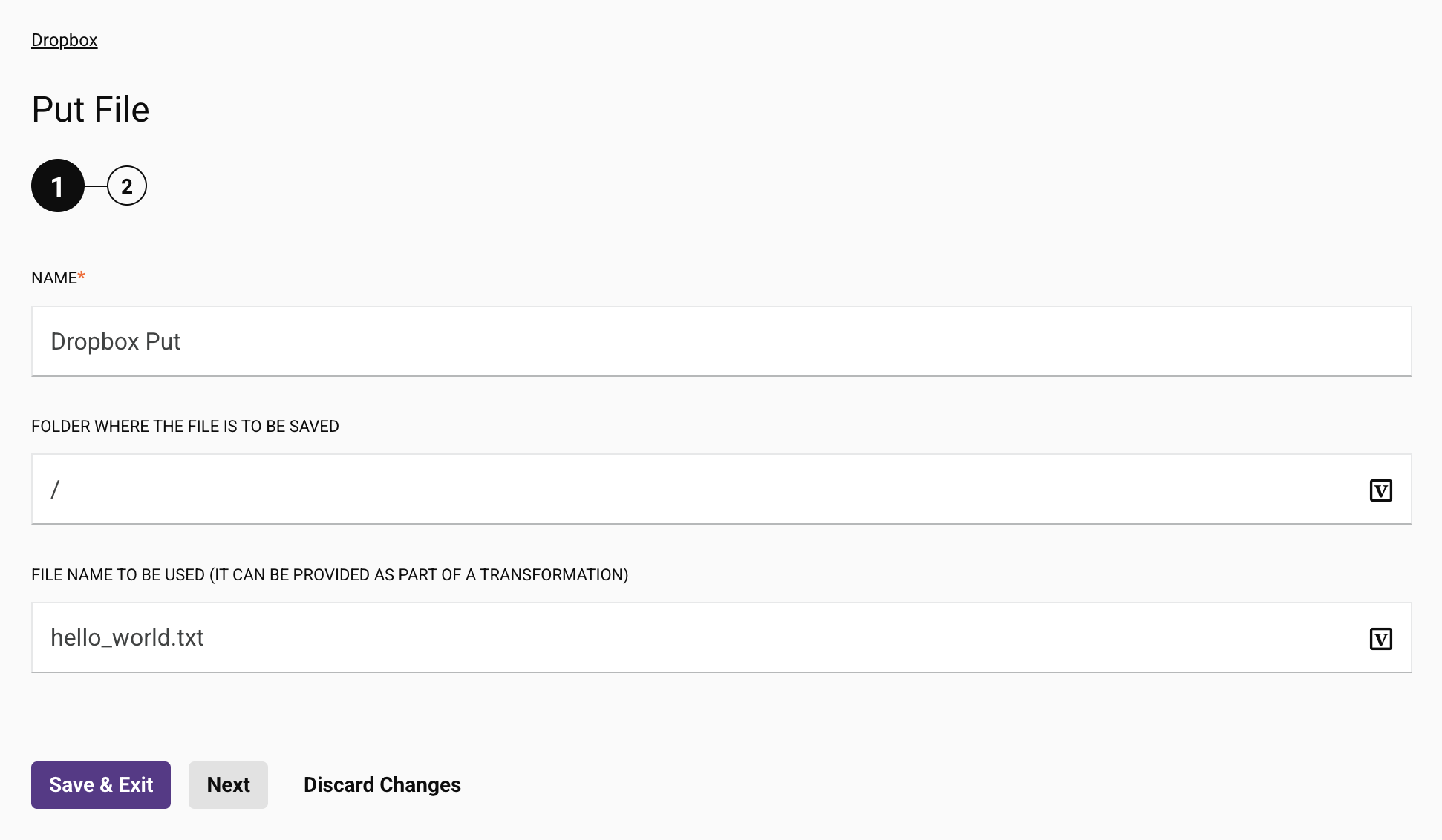
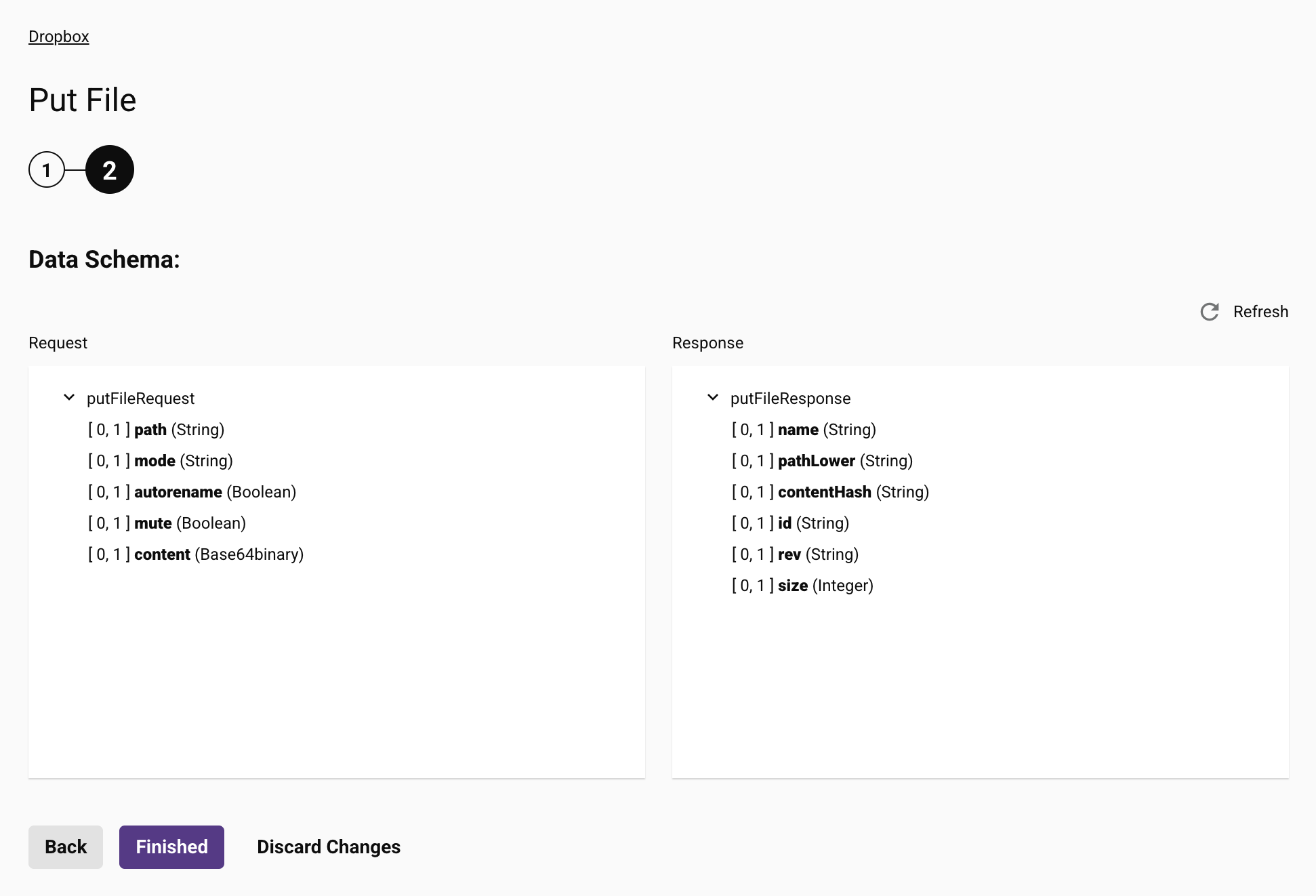
For activities, there are at least two steps: a beginning page with a name field and an ending page showing the data schemas for review. Both of these pages are created automatically by the infrastructure and are not included or defined in the JSON file.
In this example are starting (page 1) and ending (page 2) steps:
Single page
If the connection or activity can be configured on a single page and pagination is not required, a simple structure can be used:
. . .
"properties": [
  {
    "name": "<name-1>",
    "displayName": "<display-name-1>",
    "type": "string",
    "validators": [
      {
        "name": "required"
      }
    ]
  },
  {
    "name": "<name-2>",
    "displayName": "<display-name-2>",
    "type": "string",
    "validators": [
      {
        "name": "required"
      }
    ]
  }
]
. . .
Multiple pages
However, if the configuration is longer, with multiple values to be set or reviewed, pagination is recommended to keep the views smaller in depth:
. . .
"properties": [
  {
    "name": "page1",
    "displayName": "<display-name-page-1>",
    "type": "pagination",
    "children": [
      {
        "name": "<name-1-1>",
        "displayName": "<display-name-1-1>",
        . . .
      },
      . . .
    ]
  },
  {
    "name": "page2",
    "displayName": "<display-name-page-2>",
    "type": "pagination",
    "children": [
      {
        "name": "<name-2-1>",
        "displayName": "<display-name-2-1>",
        . . .
      },
      . . .
    ]
  }
]
. . .
Note
Though pagination is supported, the display name (the displayName field shown above) is not displayed in the Integration Studio UI in each step. This field can be used by a developer to distinguish the pages in the JSON file.